In Brief
Sugar Land Town Square was opened in 1996 to serve as the central business district for the city of Sugar Land, Texas. In addition to being the seat of government, the development is home to a variety of retail and hospitality businesses, office spaces, condominiums, and a large, outdoor, public events space. Like many developments of its kind, Sugar Land Town Square sought to re-envision the complex to better align with demographic shifts and the challenges posed by online retail.
We were approached by space creation company, Rebees, to collaborate with their team in this re-envisioning process by utilizing our expertise to create an engaging new brand identity and strategy for the complex.
Services
- Strategy
- Logo & Visual Identity System
- Brand Guidelines
- Collateral & Marketing Materials
- Signage
- Website Update


Our discussions around Sugar Land Town Square were centered almost completely around what can the multi-use space offer that can’t be equaled or matched by other developments? Our research indicated that despite the ability to purchase online, people still enjoy the social aspects of shopping and will seek out retail that is unique and experience oriented. With a huge calendar of public events and concerts, a walkable format, City Hall, and extensive food & beverage options, Sugar Land Town Square is perfectly structured to adapt to this new paradigm of community focused, experience driven retail.
As Sugar Land is one of the most diverse cities in the country, it was also important that whatever we created be welcoming and inclusive, but do so in a natural and casual way rather than pandering. The idea is that Sugar Land Town Square is the place where the city gathers— where everyone is welcome.


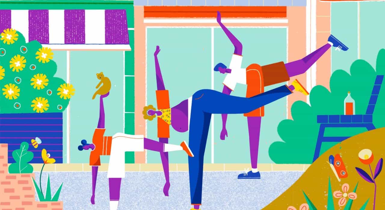
We also had an added challenge in that our brand and design initiatives formed the leading edge of an ambitious, years long redevelopment of the physical space. We needed to project change in attitude and were targeting a younger demographic with the new brand identity but were limited by the fact that most development had yet to be done. This ruled out using photography, for which we almost exclusively replaced with illustration. In addition to being able to depict the feeling and aspirations of the future change, illustration also introduced a bit of playfulness and space for people to project themselves into.
For the full logo wordmark design, we were attracted to the idea of Sugar Land Town Square being the place—or center of Sugar Land—where the city meets. Centers and places are traditionally marked by a dot. A graphic circle was used to not only mark SLTS’ place, literally and metaphorically, at the center of the city, but also to use it as a window at the center of the logo that can be filled by the various things that make the community great.


We worked with illustrator Ellice Weaver to create a variety of illustrations that could be used to support, and be a part of the brand identity system. A simple but flexible brand mark, monogram, and expansive color palette created flexibility for a wide variety of needs without being overwhelming when used in tandem with the vibrant illustrations. This flexibility also allowed for the SLTS brand to be recognizable when paired with tenant brands for advertising.