Getaway Sticks
Brand Identity, Marketing Collateral, Messaging, Naming, Packaging, Website Design
Brand Identity, Marketing Collateral, Messaging, Naming, Packaging, Website Design

(photo by Getaway Sticks)
Getaway Sticks are elegant, versatile heels designed to balance true comfort with fashion for all occasions—day or night, formal or casual.
Getaway Sticks is a women’s fashion footwear brand dedicated to empower women through a simple idea: Create an elegant heel that is actually comfortable AND stylish. They enlisted our help in building an identity which made the product as fun, fashionable, and flexible as the person the shoes were designed for.

Getaway Sticks was founded by a neuroscientist with the goal of solving women’s two shoe problem: the heels worn in the office and the sneakers changed into for the commute or for the rest of the day. Women’s fashion oriented shoes are notoriously uncomfortable, thus inhibiting the ability to move freely. And, typically, comfort often equates to boring.
Coupling the latest technologies from technical and athletic shoes with science-based design, Getaway Sticks creates styles that are timeless and truly comfortable for women as they move through their day for both work and play.
Our recommended approach was to merge the best attributes of both ends of a spectrum—incorporating the acceptance of high fashion and the innovation of Silicon Valley—to create an outcome which feels at once familiar, but fresh.
Additionally, it was important that the brand similarly straddle the two worlds of work and play. It needed to feel refined, but also breezy and playful.

Fig. 1 360 view of Getaway Sticks, Forest colorway

The name derives from 1920s slang for getting a move on: “We better put on our getaway sticks and get over there!” Later, this morphed into use to describe women’s legs. While an unusual way to express motion and femininity, we felt it was what could make for a unique brand and voice for its playful yet sophisticated tone. As a way of conveying this, along with intended to appeal to all women of all walks, we commissioned custom illustration by Ellice Weaver. The idea being that we needed the target audience to imagine themselves as a part of the Getaway Sticks world through whimsical illustrated personas.
To emphasize the name’s meaning, we created an aesthetic that was part breezy vacation and part Chanel, seeking to create a universal “little black dress” brand style. The duality between work and play were kept alive with type choices which combine Jazz Age specific style, with relaxed hand drawn letter forms.
Consumer retail products are an opportunity to expand design to packaging, and in many cases, the product itself.

Fig. 2 Chanel's "Ford" model 817, Vogue magazine, 1926

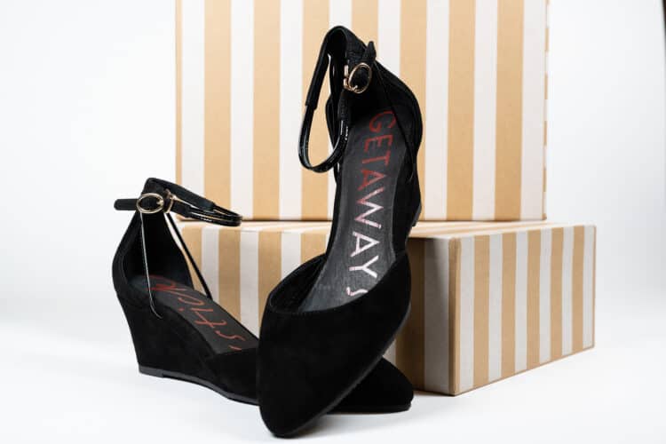
We covered the length of the insole with the logo mark altering the direction of application between the shoes. We liked the idea that the toe cap would hide part of “Getaway” and its structured typestyle on one shoe and “Sticks” with its flowy handwritten style on the other. Basically, the shoe’s structure itself let the playful side of the logo emerge on one side and the professional side on the other.
The sole’s pattern utilizes a simplified, interlocked version of the monogram—its form referencing the ankle strap clasp—as an all over pattern we designed to cover the forefoot. This gives water a place to channel for great grip, and a fun design element over more basic tread designs.
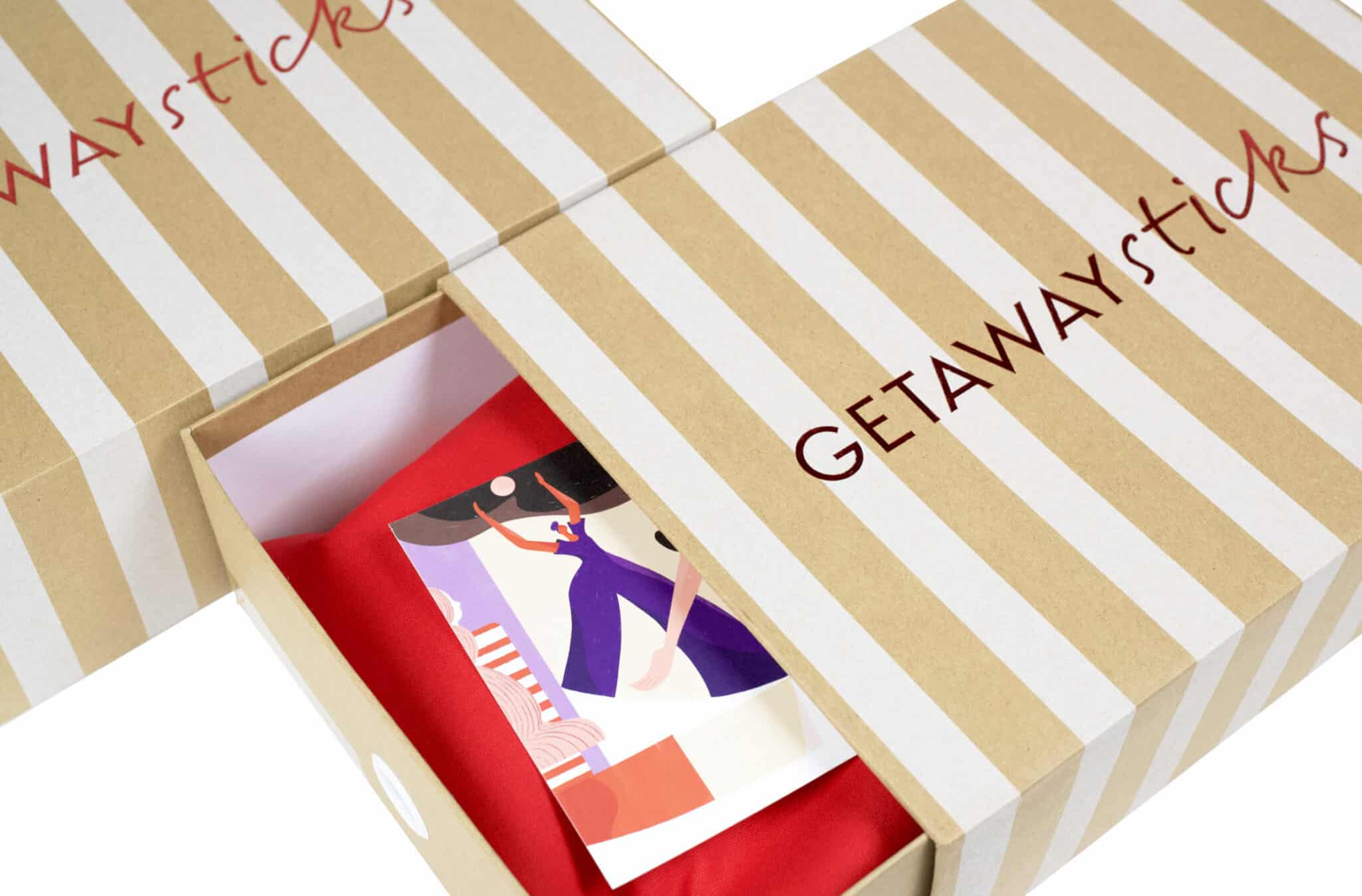

Custom designed packaging encompassed foil stamped slip case box, printed insert, and silk screened red inner bag. The form was chosen for its flexibility and usability as a storage system (use and reuse being the best form of resource conservation). The sturdy kraft box allows easy access while stacked for those who prefer to store their shoes in box, and the cloth inner bag protects the shoes for travel or storage on a shelf.
Education and information was always a critical component in the marketing and success of Getaway Sticks as much of what makes the product different—materials, construction—isn’t apparent just by surface looks. This, combined with a desire to foster direct to consumer sales, made an informative website which aided ordering and fulfillment a necessity.