

Fat Cat Creamery
Brand Identity, Environmental Graphics, Packaging, Space Design, Website Design
Brand Identity, Environmental Graphics, Packaging, Space Design, Website Design
Fig. 1 Combination Mark

Fat Cat Creamery is small batch, handcrafted ice cream producer with a set of core values that support sustainability, locally-sourced ingredients, a product of uncompromising quality, and most importantly—fun.
What began as a side enterprise by two owners and an ice cream cat quickly found a following and evolved to a brick and mortar shop.
Fat Cat Creamery had experience producing their product on a small scale, but was laying plans to enter the marketplace first with wholesale offerings, followed by the addition of their own retail storefront at a later date. We were tasked with the creation of a visual identity which could expand to encapsulate their evolving needs, as well as the associated tools and assets necessary to progress at each step of the process.

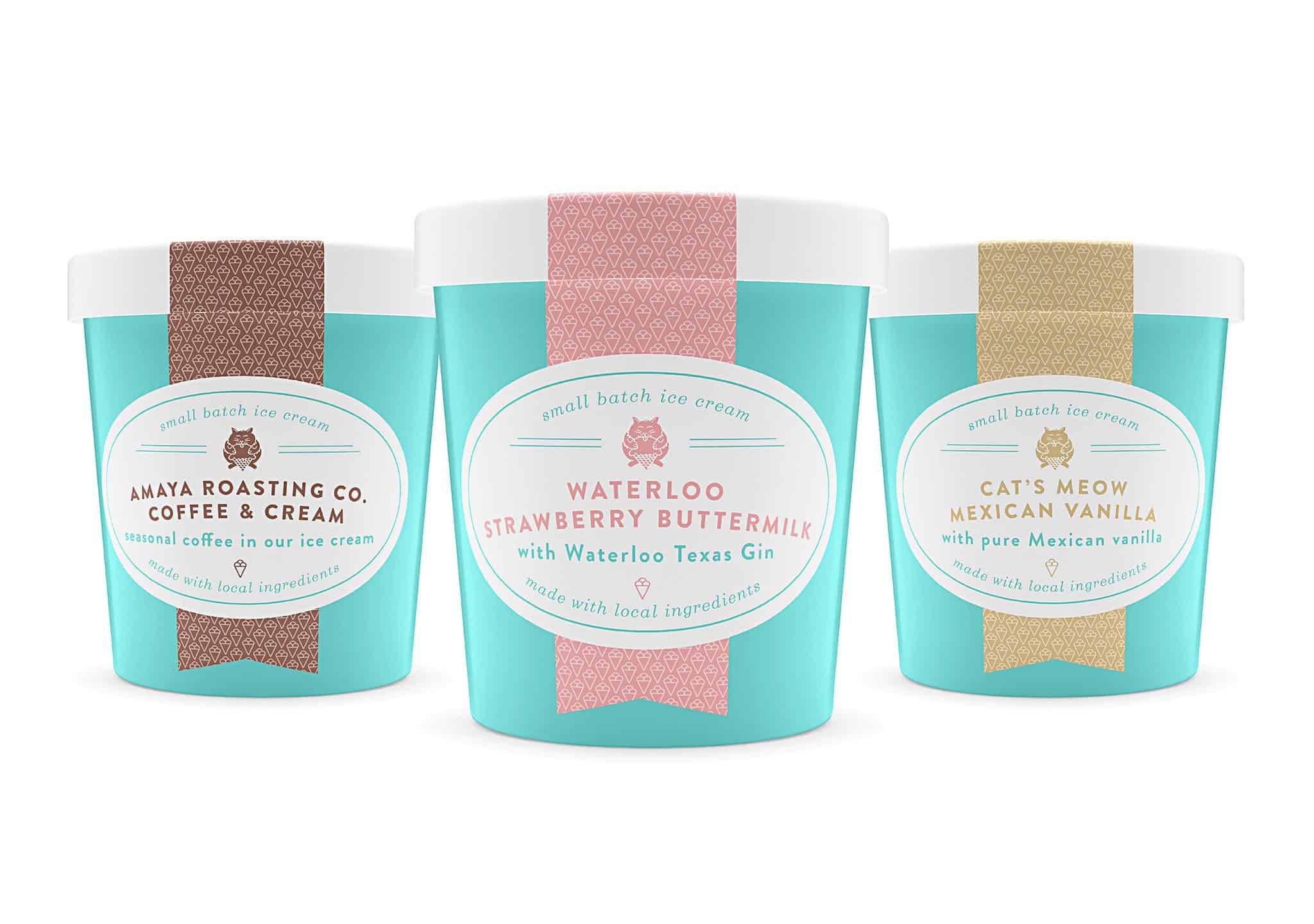
As Fat Cat Creamery was a new product to the market, the chosen strategy was to build a brand with extreme approachability while being evocative of the bygone sweet shop. It was also important that the brand be expansive and have a healthy sense of whimsy.
Working from a sketch of an ice cream eating cat created by the brother of one of the owners, we developed an icon of a portly cat perched atop a waffle cone paired with typography reminiscent of neon signage. The color palette is classically sweet, but meow-der louder. Of prime consideration, was the ability to adapt the logo mark easily to a variety of uses— including a circular seal which was a must for their retail packaging.
Similarly, Fat Cat Creamery’s website presented endless opportunities to expand the brand and build an experience as fun as it is unique. In addition to numerous animations we’ve rewarded visitors who linger to explore with surprises such as meowing and hissing cats, or icons that come alive.

Interior space, Houston Heights retail location. Hand painted signage and custom artwork.


When plans began for Fat Cat’s retail parlour, we turned to the classic sweet shop visual devices, balanced with a touch of the handmade. Polka dots, candy stripes, a tin tile ceiling, and sugary scripts complement against more rustically finished surfaces such as plywood sheathing and industrial inspired fixtures to create a space which is nostalgic, yet modern. To aid in making the small footprint of the space more expansive, fixtures and furniture along the entry wall were eschewed in favor of an enormous hand painted mural. Details abound with a combination of food safe vinyl applied to dispensers and showcases coupled with hand painted signage throughout the space. In addition, we created custom, pop art inspired graphical elements from images of the owners’ cats to adorn the walls.


Our branding has helped Fat Cat Creamery’s retail parlour and products become a runaway success. Their identity is well recognized throughout the region, their treats are stocked at an ever-growing list of retailers, and the lines at their location are reliably out the door—rain or shine. For proof of the power of the brand, you need look no further than the shear number of customers—ice cream in hand—that pose for a picture in front of the giant Fat Cat mural or a delicious bit of typography.
Thrillist: The 40 Best Ice Cream Shops In The U.S.


