Breathe Moore Training
Brand Identity, Environmental Graphics, Marketing Collateral, Signage, Website Design
Brand Identity, Environmental Graphics, Marketing Collateral, Signage, Website Design

Fig. 1 Breathe Moore Training word mark
Breathe Moore Training is a state-of-the art personal training and fitness facility located in Houston’s Galleria area. The name is not only based on that of its founder, Moore, but also a reminder that wellness—in both fitness and life—stems from a positive outlook and balanced lifestyle.
Photograph by Robert Seale

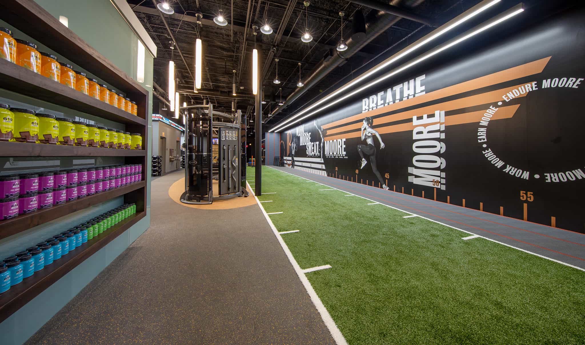
Fig 2. Wall graphics

Photograph by Robert Seale
Individuals have many reasons and motivations for seeking Breathe Moore Training’s services. Unlike a crossfit box or weightlifting gym which has an inbuilt culture and quantifiable objectives, Breathe Moore’s clients are not bound to any methodology, means, or reasoning for seeking to improve their fitness. Any solution we proposed needed to appeal to a thirty year old seeking a more muscular build through weights, as well as a fifty year old who desires a healthy lifestyle through cardio and yoga. The single unifying thread among these individuals was a desire for betterment through fitness.
Based on historical customer data and research, we knew that Breathe Moore Training’s clientele were likely to be motivated equally by singular attention, personal service, fashion, and design.
We approached the creation of a brand identity system through the lens of crafting a marquis brand that projected energy and positivity as well as refinement and luxury.

Fig 3. Custom branded dumbbells

Metallic bronze, tone on tone colors, and a variety of matte and gloss finishes create a brand which feels muscular, but refined. Equally athletic, technical, and fashion. Coupled with aspirational messaging and a variety of logo and word marks, the Breathe Moore Training brand is easily expandable to a large host of applications and products.
The newly constructed space, designed by Johnson Atala + Associates, is anchored by a suite of signage and wall graphics including a sizable, fifty-eight foot long branded panel that runs the length. Seeking to further communicate Breathe Moore Training’s attention to detail, we sought every opportunity to make the items clients interact with feel special and considered. From anodized aluminum signage, embroidered towels, and the equipment itself, every attempt was made to extend a considered, and personal brand experience.
Additionally, Field of Study sourced and provided art direction of professional photography by Robert Seale for use on a mobile friendly responsive website and other marketing collateral.

Fig. 4 Etched glass lobby divider


Photograph by Robert Seale

Photograph by Robert Seale