Fig.1 Wordmark
In Brief
FMW|FabLab is a design-build practice focused on creating unique and contemporary solutions to furniture, fixtures, and products for visionary [badass] clients. They sought a brand identity and website which more fully reflected the quality of their work and aligned with their aesthetic sensibilities.
Scope of work
- Logo & Visual Identity
- Website
- Messaging
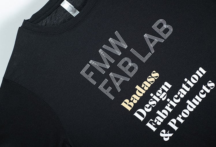
- Gear

Fig.2 Business cards

The world is full of things which blend in and don’t call too much attention to themselves. FMW|FabLab does not make these things.
FMW has focused on creating items with a style that is personal, and slightly outside the ordinary. Their work is at once both machined and handmade in appearance.
We sought to create a brand system that captured the interplay between the human and the machined both in approach and specific choices like typography. FMW’s primary mark is derived from skeleton typeface forms found in AutoCAD that allowed easy converting to tool paths for plotting or CNC machining. We coupled this with a secondary mark that has a long history of indicated quality—the maker mark stamp. Containing a decidedly un-traditional monogram that bears resemblance to their metal forms and tools, FMW’s stamp is a personal counterpoint to their structured primary mark.
Visit their website