

Fig. 1 Lettrefina Logo
With over 100 monogram styles, endless possibilities for customization, and a curated selection of fine linens, Lettrefina offers a full-service experience for a range of tastes.
In Brief
Due to a conflict, Boxwood Linens needed assistance in establishing a new identity for an established clientele. They were seeking a new name and outward appearance that would effectively communicate their value to a premium marketplace and align with their style.
Scope of Work
- Naming
- Logo and visual identity system
- Packaging

Fig. 2 Notecards, custom ribbon
After selection of the new name—Lettrefina—we set about creating a brand which was consistent with the tradition and heritage of monogramming, but with a more European and modern edge. Through the outward presentation, we sought to communicate the uniqueness and singularity of Lettrefina’s offerings in a precious and fretted-over manner without the baggage of place or time.

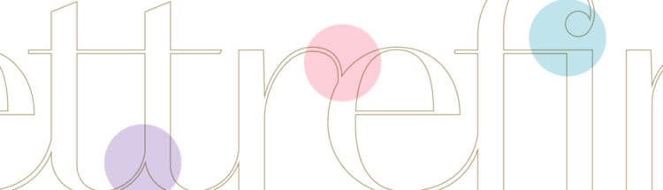
We chose, and modified, typography to create a word mark that feels equally at home in the new world or old, at once modern and retro. The interplay between thick and thin lines and the ligatures between letters are meant to communicate the act of hand stitching and thread flowing in and out of fabric while a palette of soft pastels coupled with metallic gold reinforces the air of luxury and rarity.

Fig. 3 Stationery, self adhesive small and large label
The idea of rarity and obsession was carried through the packaging with custom ribbon, tissue, and a variety of box, bag, and labeling options to ensure that each package effectively communicates just how special its contents are.


