Art League Houston
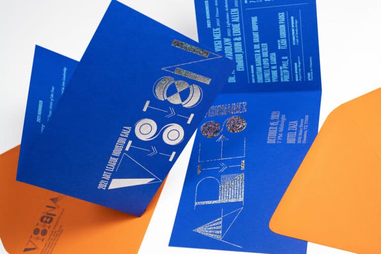
Invitation Design, Brand Identity, Environmental Graphics, Marketing Collateral, Signage, Website Design
Invitation Design, Brand Identity, Environmental Graphics, Marketing Collateral, Signage, Website Design


Fig. 1 North Facing Rendering

Fig. 2 West Facing Rendering
Art League Houston was founded in 1948 and at 68 years old, is one of the oldest non-profit organizations in Houston.
Art League Houston has radically evolved beyond the parameters of traditional art leagues. While still keeping the traditional art league model of a robust and engaged membership, Art League Houston has embraced modern approaches in curatorial programming, education, and community building for an increasingly diverse audience. They believe in creating a conversation around art that is challenging and reflective of the vibrancy and diversity of Houston in general. In their efforts to act as a support structure to working artists in the Houston community, Art League Houston is dedicated to provide an outlet to work and individuals who for a variety of reasons, may not have other outlets available.
Due to this, Art League Houston is undertaking a rebranding initiative to align their identity with the challenging, thought provoking nature of their organization. Although an art league in name, they desire to visually distinguish themselves from preconceptions and prime the public for an engaging experience beyond what they may expect.


Our primary goal in examining Art League Houston’s brand system was to realign the outward identity to more accurately reflect the organization’s internal philosophies. Our research and surveys identified four key attributes for Art League Houston—innovative, experimental, accessible, and inclusive—none of which were reflected in the existing brand.
We set out to build a system which felt energetic and engaging while maintaining adaptability for a wide range of applications and assets. We felt that given these core attributes, an element of unpredictability and variety was appropriate.


Fig. 3 Previous logos

In over a half century of time, Art League Houston has operated under a variety of logo marks. In building their new identity, we took inspiration and features from several of their past logos as well as the building’s distinct shape and corrugated aluminum siding.
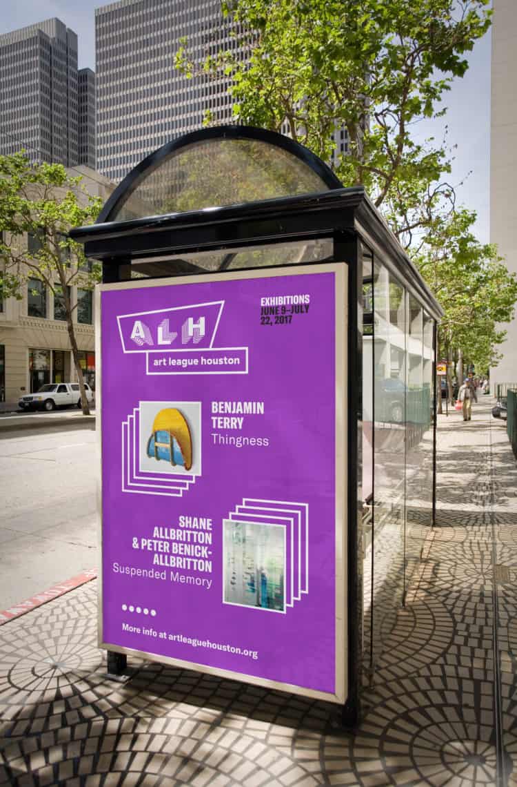
The result was a playful combination mark which could be used in its entirety or split into it’s acronym, ALH, for use as a repeating pattern and throughout messaging to signify inclusiveness as a stand in for the word “all”.
As the organization has multiple facets of programs, we assigned a specific color to each area as a quick means of identification. Educational programming was coded pink (a well loved carry-over from the past brand system), community programming green, and exhibitions purple. Additionally, we assigned each area a verb—make, talk, see—based on a phrase from the organization’s mission statement. A system of icons based on mark-making such as arrows, squiggles, dashes, and dots as well as a “messaging” ribbon provide additional support.


Fig. 4 Mark making

Fig. 5 Color palette
An additional point is that we felt it important that Art League Houston have increased visibility as a brand in comparison to the traditional way in which materials are handled by arts organizations. Typically, external facing materials lead with, and highlight work on exhibition or programs with the organization’s presence taking a secondary concern. This seemed not only ineffective, but at odds with the idea of the arts organization as curator—rather than an event space.
The overarching idea is that you may not recognize the program or artist being presented by Art League Houston, but as you understand the organization and their mission, you’re likely to find it engaging.


