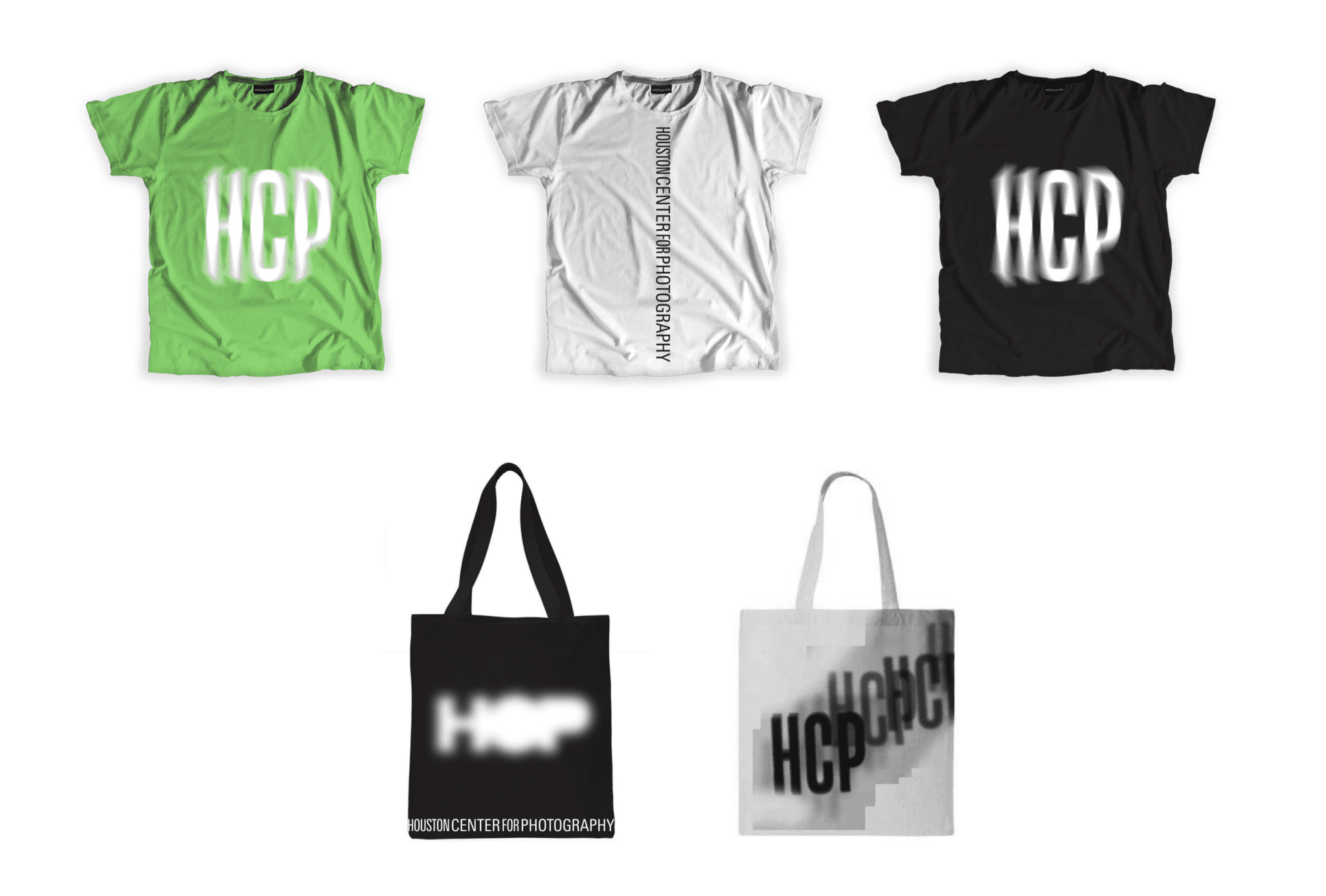
Since 1981, Houston Center For Photography (HCP) has served the Houston arts community as a resource to learn about and engage with others passionate about the art of photography. After 36 years of operation, HCP found that they needed to refresh their identity to align with a younger audience as well as a newly updated mission and vision.
HCP traditionally, had been focused on and perceived as an organization directed toward teaching photography as a technical skill. Our research and stakeholder surveys indicated that as technology has made the technical aspects of photography less important, younger audiences were more interested in using photography as an artistic tool to experiment and express their vision.
The overall tone and brand system were specifically designed to aid and facilitate HCP’s transition into a focus on photography as an art with a secondary focus on education and programs. This meant an increased emphasis on exhibitions and curation. We explored several approaches and sought to create an identity for the organization that was distinct, experimental, and captured the essence of photography without using the expected tropes such as an aperture.
In one direction, we found that by printing HCP’s new word mark and moving it in a variety of ways under a camera’s long exposure we fulfilled those objectives—creating a series of dynamic logo marks that nods to photography’s ability to play with the capture of movement and time. The corresponding brand system was aimed at being dynamic and future facing, without overpowering the artists and artwork it featured.

